london 2012 olympic logo

this cost £400,000 - four hundred thousand fkin pounds...
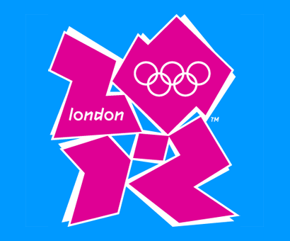
image: london2012_logo

WHAT A SHAMBLES
give us the old one back

image: london2012

even the french would have made at least a logo with cheese or something

image: small-blue-yellow image: small-green-yellow image: small-orange-yellow
Comments
25
haha how ugly :D
\LOOOOOOOOOOOOOL paint skills
its pink!
Trust the UK to come up with something like this :<
hah what a craplogo XD
well thats kinda gay tbh
seen ur flag :P

but yeha it does kinda suck
Parent
well if there was a green one with a cannabis logo i would take it, but there isnt :(
Parent
i hope ur joking or its a disgrace to be english with that logo, i bet tony blair designed it.
nice completely missing the whole newrave point, and ending up looking like a throwback to sessame street
you understand why it's like this tho right? it's fucking obvious, especially when they keep saying they are targeting a younger generation and also the fact the olympics is being based around a really shitty area of london
Parent
i understand the intention, i think the execution, largely helped with a massive dose of marketing hyperbole and jargon, has failed to deliver
Parent
It sucks, really. :<
rolf, old one is much better
u got to be kidding right?
£400,000 for this shit ?
this only thing i like about it is the end of this video http://www.london2012.org/about-newlook-video.html
i lold @ animation XDDDD
ïts beatyfull
lol thats really shit. I was watching this TV program and Sebastian Coe was on it saying how good the logo is, wtf.
Back to top